When you think about your favourite brand, chances are its colours pop into your mind instantly.
That’s not by accident; that’s colour psychology in branding at work.
Colour in branding goes beyond aesthetics. As outlined in Adobe’s guide to colour psychology in marketing, colours can influence how we feel, how we behave, and how we remember. They shape first impressions, evoke emotion, and even influence purchasing decisions. So yes, that colour palette you pick, it matters. Like really matters.
Colour in branding
Colour taps directly into our emotions, making it one of the most powerful tools in your branding toolkit. By understanding colour psychology in branding, businesses can appreciate the profound emotional impact that colour can have, leading to stronger connections and more meaningful customer experiences.
Your brand’s colours speak volumes before a single word is read. They help outline your personality, values, and often at times, your tone. Whether you are aiming to be bold and energetic or calm and trustworthy, colour makes a big impact.
“In my experience as a designer, colour has the ability to make or break a brand. Colour is always at the forefront of consumers’ minds when making decisions, it’s not just about looking good, but feeling right. Choosing the right colour tells your story without having to say a word.” – April Keating, Creative Designer
The emotional language of colour
Different colours evoke different emotional responses. Here’s a breakdown of what some common branding colours communicate:
Red – Passion, power, urgency
Yellow – Optimism, intellect, joy
Green – Growth, balance, wealth
Blue – Tranquillity, trust, wisdom
Orange – Creativity, confidence, energy
Purple – Loyalty, luxury, mystery
Turquoise – Clarity, calm, self-expression
Turquoise, for instance, is especially popular among communication-focused brands. It promotes clear thinking and evokes feelings of calm and clarity. According to Adobe, it’s one of the most inspiring colours in modern marketing and is great for brands that want to recharge, uplift, and provoke positive thought.

Trending colours in 2025
As we move forward to the present day, brands are becoming bolder, moving away from traditional palettes and experimenting with unique and emotionally charged combinations. Some of the trending colours this year include:
Mocha Mousse (Pantone’s Colour of the Year): a warm, grounded brown symbolising stability and comfort
Seafoam Green: fresh, calming, and nature-inspired
Butter Yellow: cheerful and nostalgic
Terracotta Sunset: earthy, adventurous and grounded
“It’s important to highlight that you shouldn’t always just choose the colours that are trending, you should look at the bigger picture. For me, personally, it’s about picking the colours that look amazing and really speak with the audience.” – Neil Arch, Creative Designer
Choosing the right colours for your brand
Before you reach for a colour wheel, ask yourself:
What emotions do I want my audience to feel?
What values do I want to communicate?
What tone best reflects my brand?
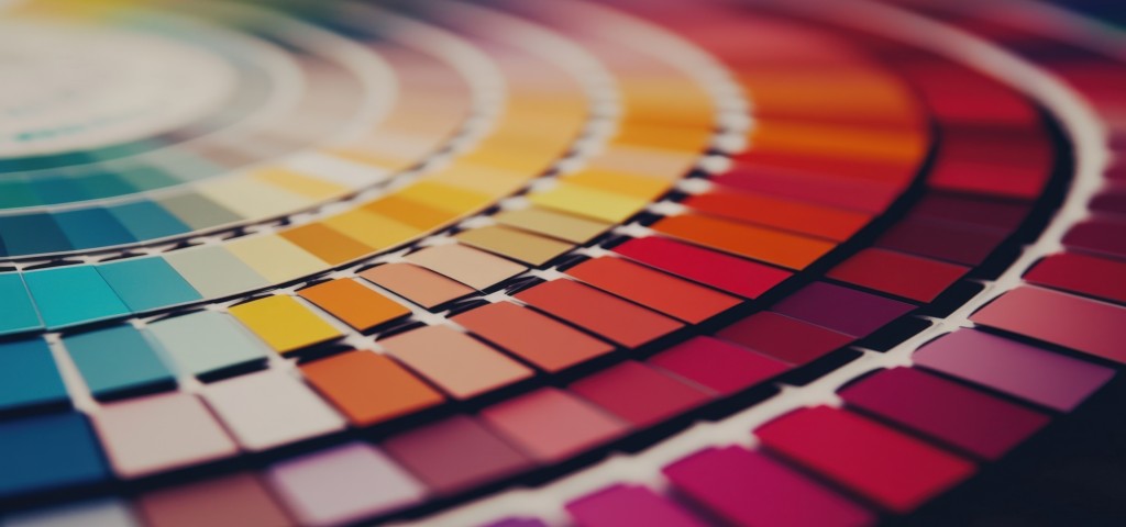
Start with the feeling, then match it to the colour. Use tools like the colour wheel to find harmonious pairings, but always root your choices in psychology and purpose.
“Trust your emotional response to colour first. Choose based on your emotional connection and how they fit the brand’s identity. If an existing choice clashes with the brand’s feeling (e.g., vibrant blue for a relaxing spa), explore toning it down to align with the desired emotion and brand purpose.” – Beth Lodger, Creative Designer
Your brand’s visual identity is one of the first and in most cases longest lasting impressions you’ll make. And colour? Well that’s a critical part of that impression. When used intentionally, colour becomes more than decoration, it becomes a statement!
Need support with your brand identity? Talk to our team today!
[email protected] | 01780 484450
Pssst… They have very good taste in colours too!


